PROPOSED SPATIAL WORKS
about
The following proposals work to highlight place-based cultural identity and diversity through the exploration of ambient visual pollution and color schemes distilled from the built environment. Each project uses high impact colours and geometric imagery to awaken the viewer to their landscape. Mário continuously explores the dynamic relationship between urban fabric, community, and color in the context of the spaces we move through everyday.
He has collaborated with writers, interior designers, fashion designers, engineers, musicians, and architects worldwide on such projects, and plans to continue to grow and expand this element of his practice.
As a multifaceted artist actively working in a wide variety of mediums, Mário has participated in many installations and commissions. After being awarded the Gulbenkian Foundation Scholarship, receiving his Master in fine arts from the University of London, and completing three years of a PhD researching colour trends in fine arts, he went on to be commissioned by the Olympic and Paralympic Games Committee, as well as twice by the Cape Farewell Foundation. He has been a finalist for various residencies, including the National Parks Arts Foundation and the Hawaii Volcanoes Artist Residency. Site specific interventions are another large and very important facet of his practice, each one unique and bespoke to the needs of the space.
Capp Street Mural
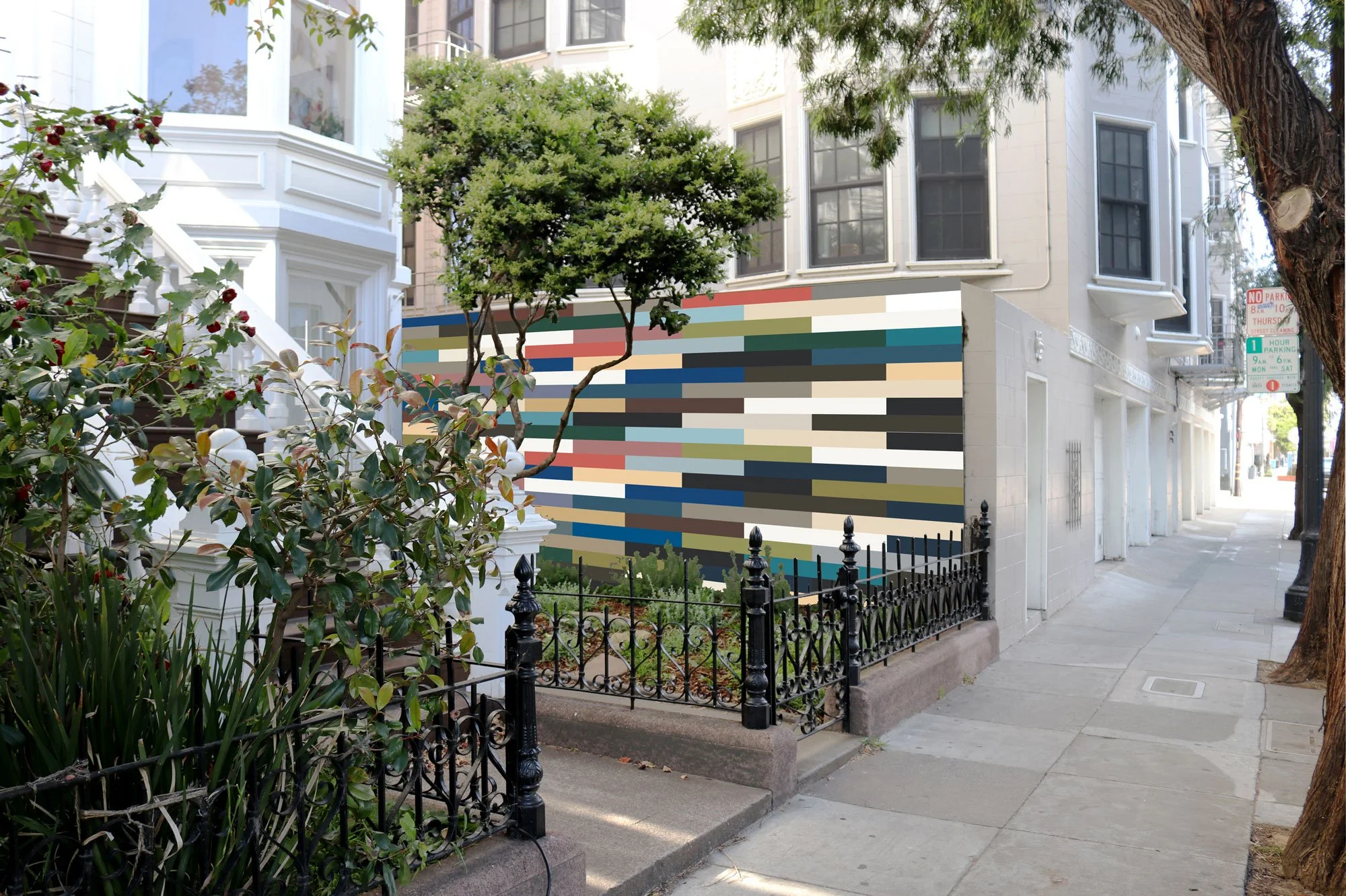
This proposal for a mural in San Francisco’s Mission District is unique in that though it would occupy a traditional private garden, it would be applied to an exceptionally large and mostly unobstructed wall, leaving it exposed to the many passerby. It therefore would have had to not only reach out to the public but also align with the tastes of the homeowner. This was an opportunity to engage with the current context of a rapidly changing neighborhood, and
so color studies were conducted of the surrounding historically significant and bright Victorian homes. This mural strove to collaborate with the natural grain and texture of the concrete wall by applying painted stripes of colors in three sections from the condensed color studies palette. The application of these stripes would serve to memorialize and iconicise this neighborhood’s present palette and color identity.
Hunters Point Barriers

Superimposed on k-bar barriers in Hunter’s Point in San Francisco, this project proposed to explore the ephemerality of an art intervention viewed from a moving vehicle. The inherent motion both within the piece and within the nature of the viewing would create a tension between the individual and the art object that is dynamic and ever changing, like San Francisco, constantly reinventing itself with the speed at which vehicles pass it by.
Mário developed a combination of colors and geometry based on Bus 33 No. 8 as well as the architecture and landscape of Bayview and Hunter’s Point, distilling palettes from the bright houses and placing them against the grayscale skyline of the city. This mural would therefore define the location, and by extension the neighborhood around it, with beauty, joy, and dimension.
Amplified

An evolution of Amplification, this site-specific mural proposed to investigate concepts of extension through perceived boundaries. Each piece of existing work uses geometrically cut and arranged sample cards from the 2018 interior design color forecast in concert with custom built frames to explore the ways in which the frames act as extensions of the work itself. This act of extension would be continued onto the wall through both the simple contact of the frame as well as through the proposed painted intervention.
The bold outline of the frames would be amplified in black, filled with corresponding triangles painted from the 2021 color forecast. The optical illusion of the enlarged black outline would both indicate and imitate structural change to the wall itself, using paint to carve away until it would mimic the jagged edges of the frames. In this way, these works dive even deeper into the discussion of functional production of space vs fine art.
On Bus 33

“On Bus 33” proposed to explore permeability between fine art and the built environment as an expansion upon the Bus 33 series, which was inspired by Mário’s daily commute through San Francisco, and represents a collaboration between his controlled studio environment and the wildness of the city. The paints used are from the 2018 interior design color forecast. This series highlights the transition from one space to another, and makes that boundary permeable.
That permeability would be further echoed in the proposed interaction between each individual work and the gallery wall, the site of the installation. The wall would be painted in echoing patterns out of the 2021 color forecast, thereby using color alone to mark the passage of time between the creation and the display of the piece as well as to marry a space of art to a space of commercial and consumer driven design.
USF Outdoor Sculpture

An abstract arrangement of painted aluminum beams crossing and conjoining at different angles, this proposed sculptural installation would energize the space, bringing together seemingly distinct pieces into an integrated and balanced whole. The chosen colors would add a new dimension to this explored intersection, as they would have been selected based on the palettes of the surrounding neighborhoods.
Their conglomeration within this piece would therefore bring together the differing and particular experiences of the many members of this community, capturing the diversity of thought and spirituality in a city that prides itself on multiplicity. A significant element of this upright beam installation would be that at different times of the day and year, the shadows would differ dramatically. In the fashion of a sundial, this piece intended to speak to constant change as well as to difference and depth.
Hawaii Volcanoes National Park Wayfinder Series

The “Wayfinder” series hoped to acknowledge technology’s ever-expanding presence in our lives and in his practice by linking his art to the natural beauty of the Hawaii Volcanoes National Park. Where Mário typically sources palettes from the architecture of cities around him, this series would draw only upon the natural colors found within the park, which he would catalogue using the Pantone Color Application for smartphones.
The app’s algorithm would analyze each image, calling out the most prominent tones and suggesting matched commercially available paint samples. These images would have then been printed onto old metal wayfinding signs recycled from throughout the area. The result would encourage visitors to contemplate the ways in which technology constantly filters the natural beauty of the world around us. This is not to indict development generally, but to examine its relationship with the mission to preserve.
Greenwich Street Installation

A development of shapes from Amplification, this site specific installation was conceptualized to be a celebration of light and life. This piece proposed to fully explore the unique location of the staircase of a San Francisco home, a space frequently moved through as well as one exposed to an extreme abundance of natural light all day long. Mário proposed a dynamic interaction between the particularities of this staircase and the city as a whole.
San Francisco is well known for its ever changing weathers, and this artwork would have embraced all of them, adjusting its quality of perception alongside the appearance and disappearance of the clouds. Ultimately 15-20 wall-mounted colored plexiglass sculptures would have been arranged such that they would engage with both the interior and natural lighting. Due to the transparency of the material, this installation would have reflected traits inherent to the built structure as well as those subject to uncontrollable whims, acting as a bridge between the two.
Camberwell Green Magistrates Court

Situated somewhere between a medieval castle’s turret and a glowing billboard on the side of a highway, this project proposed an interrogation of everyday symbols and locations of power. Rings of bright colors would have been applied to two functional AC towers that stand between the street and the Camberwell Green Magistrates Court in London, rendering once mundane structures into visually predominant and clearly demarcated beacons.
This would serve to draw attention to the ongoing processes and proceedings
within, to the execution of local power. Without materially changing anything besides the chromatics, this project would have totally and completely altered the way in which users of the space - the street, the sidewalk, the park, the court - would see, process, and conceptualize these objects in their environment. The colors would have been sourced from the same palette as that used for Exhibit One, a realized site specific installation for an old police station from this era of Mário‘s practice.
Hong Kong Velodrome Park Being Together

Being Together is a proposal for the Velodrome Park in Hong Kong. This project would have been a continuation of Mário‘s work with large scale commissions, most notably for the 2012 London Olympic Games. Sports as a universal language are a powerful tool for cohesion, creating a sense of local pride and identity. This project was based upon these values, and would have made use of chromatic combinations intended to articulate the dynamics between athletics, local communities, and the surrounding city.
The configurations of parts would have posed as an abstract representation of how individual life experiences can be shaped by group perception; a single line may be the symbol of an individual, a group of lines a metaphor for communities, and the whole work a representation of an entire country. High gloss powder-coated criss-crossing aluminum sheets would have reflected the light variations of the surrounding environment, thereby rendering the relationship between viewer and installation as active.